For the past two months, I participated in the asynchronous online Cuesta College course, Digital Photography II (ART 249B). Below is my final project, a series of eight photos distinctly different yet based on a theme of my choice.
Theme: BLUE
I am drawn to the color BLUE—in clothing, decorating, and ceramics. I also enjoy saturating photos with one dominant hue while reducing or eliminating the saturation of the others. I think it would be fabulous to print, frame, and display a series of blue-themed photos in my home. Therefore, I chose BLUE as the theme for my personal showcase.
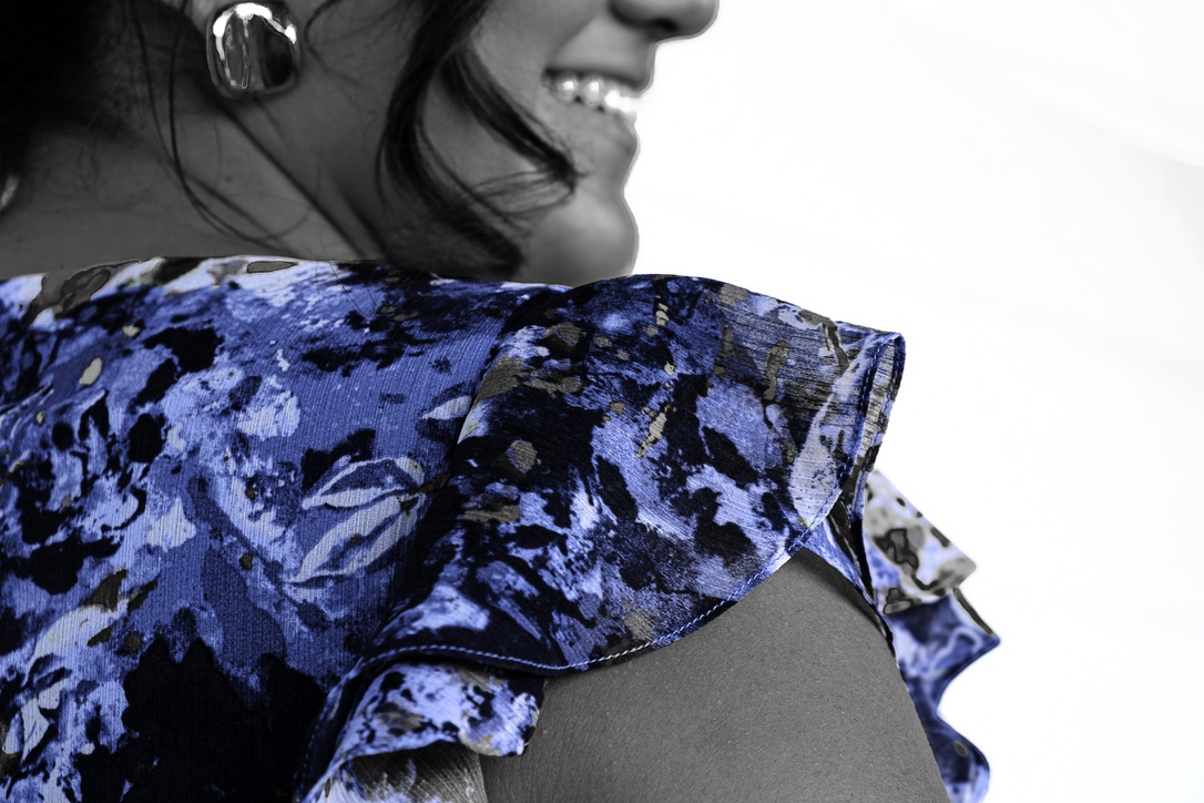
Image 1: My nephew’s girlfriend shows the promise of the future. Her smile shines, along with the BLUE in her dress. While capturing this photo (55 mm, f/5.6, 1/125 sec, ISO 640), I focused more on her shoulder than her whole body, using some of the framing techniques I viewed at the International Center of Photography. For this photo, I set saturation colors at -100 except blue, which is at +14. I found that since the original capture had multiple colors in the dress, adjusting the luminance of several sliders helped to create depth and texture.
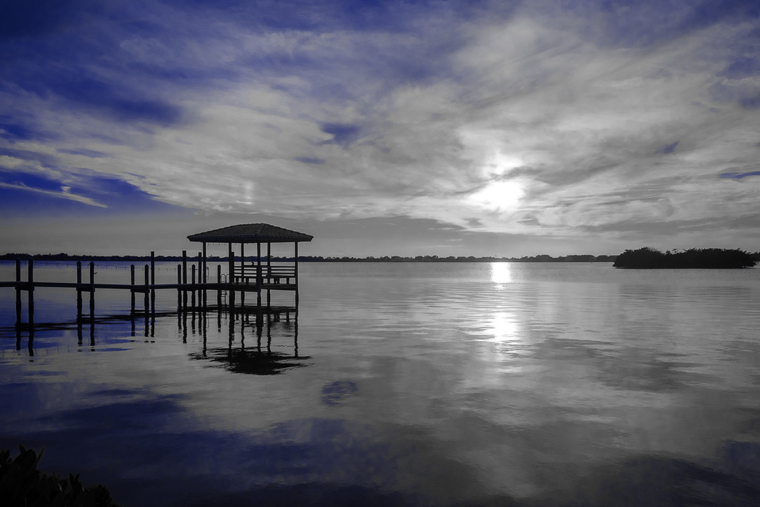
Image 2: A sunset acts as a reminder that as one day ends, there is the assurance of the next day. This sunset off Satellite Beach, Florida (18 mm, f/5.6, 1/4000 sec, ISO 800) shows the stark contrast between the sunset’s yellows and oranges, now rendered in black and white, and the remaining BLUE in the sky and its reflection in the water. All colors other than blue (saturated at +100) are saturated at -100. I found that the aqua hue needed to be turned up to +53 along with blue hue at +11 to create the visual effect I favored. Additionally, I focused on the pier to sharpen the image and added a vignette of -15.
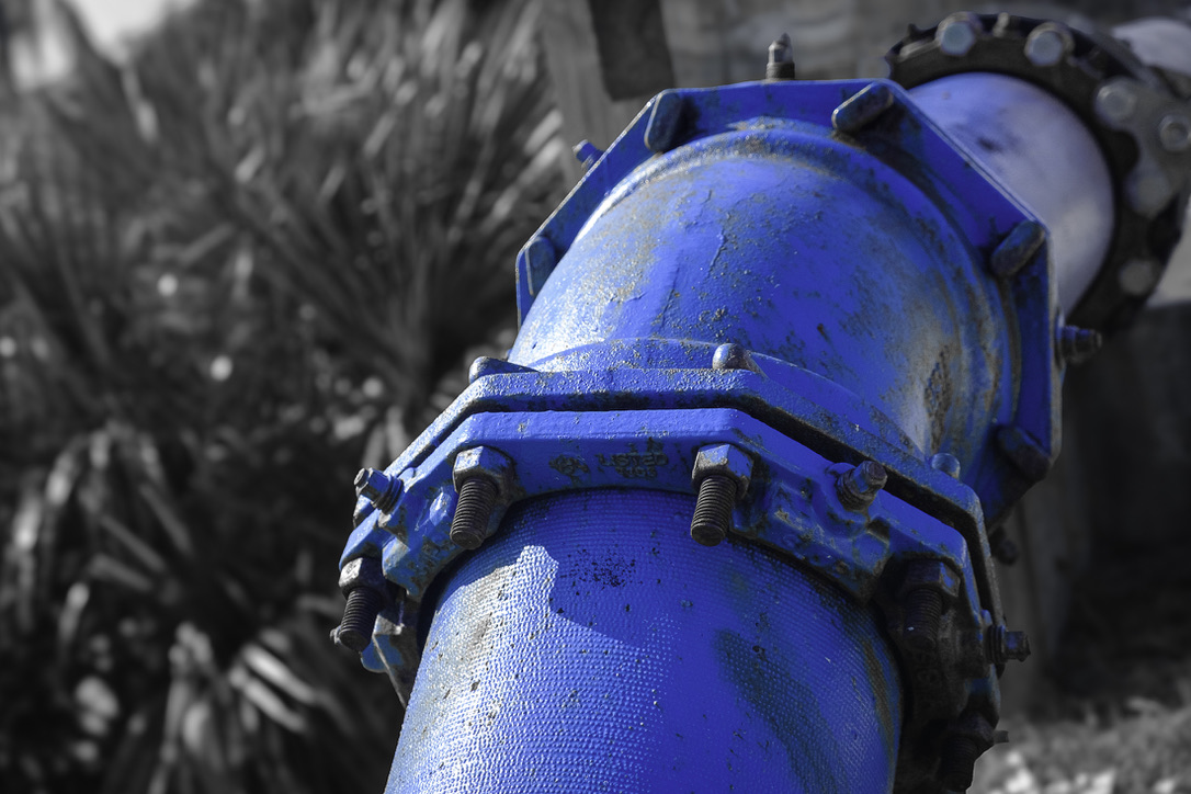
Image 3: Water is a necessity of life, flowing from the ocean through pipes and ultimately into our homes. This image (55 mm, f/5.6, 1/3200 sec, ISO 1600) highlights the infrastructure that delivers this essential resource and emphasizes the interplay of strong light and shadow. Saturation was again -100 for all colors except blue (+100). Hues and luminance all remained at 0. Using AI, the BLUE pipe was masked and inverted, so the background could be desaturated and blurred. Additionally, to further highlight the pipe, I added -15 vignette.
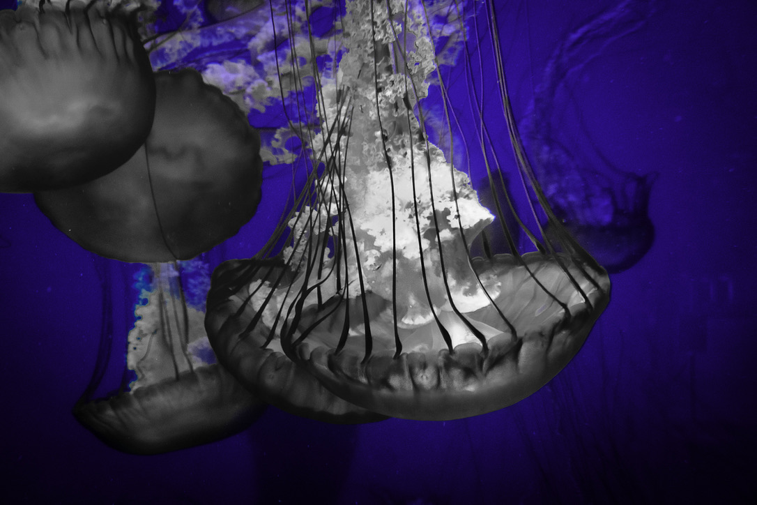
Image 4: All life needs water, even creatures as simple as jellyfish. Captured (30 mm, f/5.6, 1/25 sec, ISO 3200) at the Long Beach Aquarium, this image focuses more on the contrasting black and white of the jellyfish than the brilliant BLUE in the background. To create this striking image, luminance sliders for yellow, green, purple, and magenta needed to be adjusted. Sharpening and post-crop vignette were added for clarity and effect.
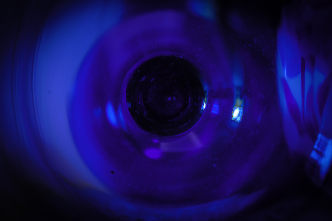
Image 5: BLUE can be found in many places, even at the bottom of a wine glass. Although not as essential to life as water, wine can add enjoyment for those who imbibe. This abstract image was captured with a very slow shutter speed (55 mm, f/4.5, 1/0.5 sec, ISO 200) and looking deep into a blue wine glass, cropping the exterior of the glass and adding post-crop vignetting at -62. To create the desired effect, it was important to adjust the white balance and exposure controls.
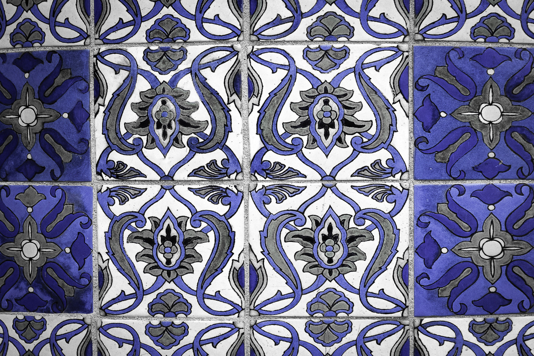
Image 6: Another form of enjoyment is hiking to the tops of hills. On Catalina Island, one can climb to Wrigley Memorial, which is decorated with handmade glazed tiles from the Catalina Pottery plant. This image (55 mm, f/5.6, 1/160 sec, ISO 800) with its sharp contrast and beautiful BLUES and grays started as an aged, yellowed, and rounded wall. To create the image from the capture, saturation, hue, and luminance needed to be adjusted. Additionally, the capture necessitated full transforming, including aspect and x-offset tweaks. Vignetting at -15 created the final image.
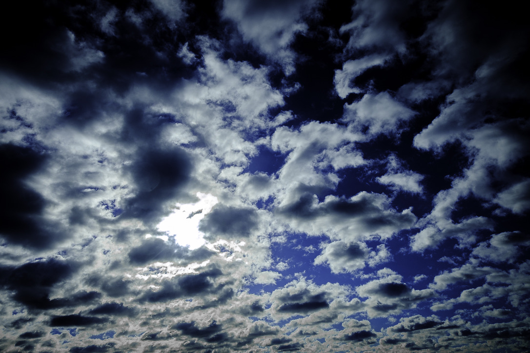
Image 7: For another variety of BLUES, grays, blacks, and whites, one only needs to look up at a cloudy sky. The assortment of colors and textures in this image (18 mm, f/5.6, 1/4000 sec, ISO 500) demonstrates how vivid an image can be even with the saturation turned to -100 for all hues except blue (+34). Interestingly, luminance for purple (-49) was needed in addition to blue (+32) to create the visual intensity of this sky. Sharpening and vignetting (-15) were the final touches.
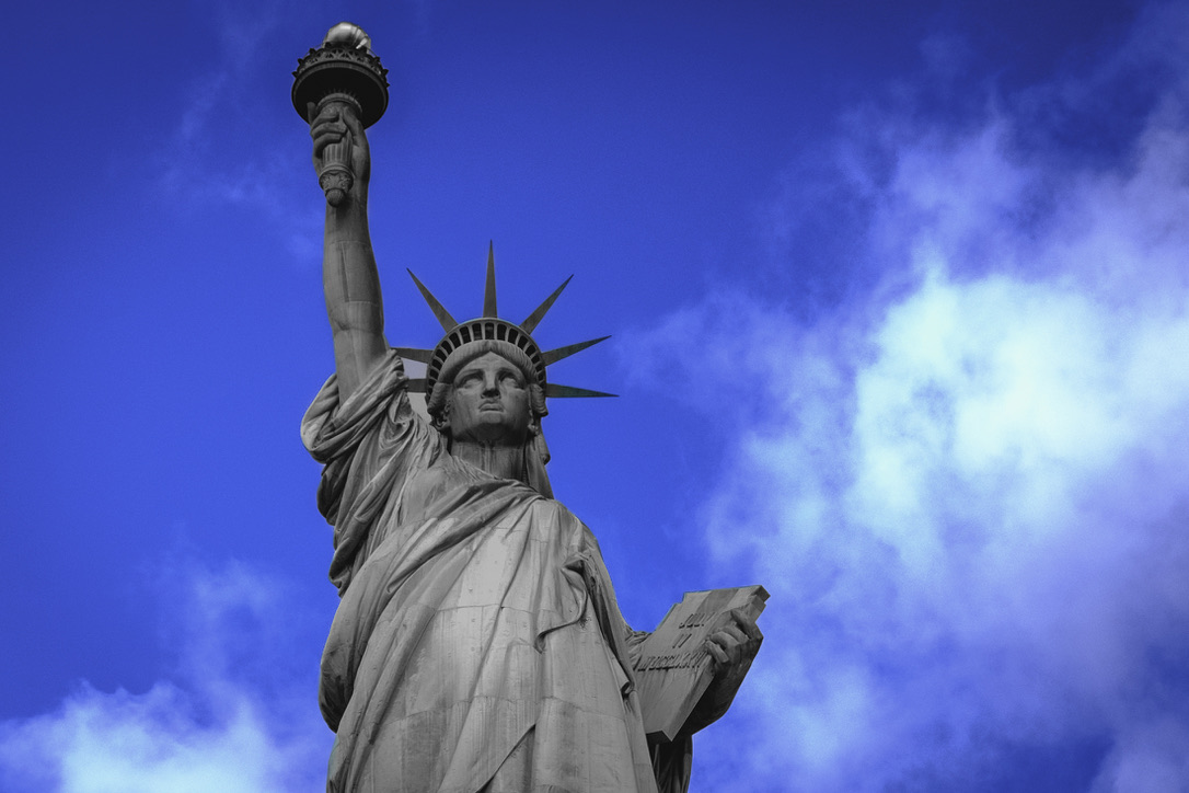
Image 8: The Statue of Liberty is an iconic symbol of freedom and welcome. Shown here in muted black and white, with added sharpening and vignetting, this image (42.5 mm, f/5.6, 1/3200 sec, ISO 800) reflects the current struggles for liberty while contrasting them with the bright BLUE of aspiration for the future. Even with clouds hovering over the horizon (Image 7), there remains the promise of a brighter future (Image 1).
This project challenged me in a myriad of ways! First, I knew my theme was a bit unusual. Choosing a color for a theme? Yes! How, though, to capture a series of images related to BLUE? I had to carry my camera everywhere! It is interesting how much BLUE surrounds us. It is also true that not every capture with BLUE in it makes a creative and inspiring final image. With 232 captures to evaluate, I decided to not only rate them (1, 2, 4, 5) but also to label them with colors based on general categories (e.g., water = blue). This allowed me to select a variety of images for my hero photos. My next challenge was to utilize Lightroom’s develop tools so BLUE enhanced an image rather than, at times, overwhelming it. I found that developing many of the initially rated “4” photos quickly allowed me to eliminate most images from my prospective hero collection. Of course, I ended up with nearly 20 hero photos after my first pass! Fortunately, I returned to my labeling to discard too many captures in one category, helping me to finalize my eight hero photos. My next challenge was deciding how to order the images in my gallery, so they make a bit of sense. If I had settled on a theme such as how to bake a cake, the order would be easier. For this project, I needed to be a bit more creative. Also, I want to print, frame, and hang these photographs. Seven of the photos are horizontal; the Statue of Liberty image was originally vertical. From the 365 Day Photo Challenge I accomplished in 2024, I know that hanging photos with differing orientations presents a difficulty. Therefore, I cropped the Statue of Liberty photo to match the others.
In conclusion, the lessons I have learned include being patient with myself, remaining open and flexible, keeping my camera handy, using all the tools Lightroom offers, and, most important, having fun. By applying these lessons, I will continue to grow as a photographer and create not only representative images but also artistic photographs.
Wow. What fantastic photos. I love the blue theme and am finding it difficult to pick a favourite. I enjoyed reading your explanation on how and why you chose the different images. Well done xx
Thanks so much, Carole.
Haha! It’s kind of like children – I can’t pick a favorite! With over 200 captures to choose from, it was hard to narrow down to my favorite eight images. Now that I’ve picked these eight, I don’t know if I could narrow down the choices even more. 😊
Yes Lisa
Huge compliments for your courage in using color to address the subject matter of a photo theme. It showcases your own style and extravagance very impressively and, in my opinion, in a very refreshing and thought-provoking way. Now I also understand your tendency to edit the photos, which we talked about in New York. This is not just photography, this is an art form. Well done!
Peter
Peter, thank you! It’s exactly what we chatted about – the idea of photography as representation vs. photography as art. Both are fabulous – and I love both types of photography. Each has a role. For most travel pictures, representative images work best, in my opinion. For art, being able to use all of the tools available, such as lighting, composing, and digital post-processing, helps turn a capture into art.
Nicely done Lisa. Love the saturated blues.
That means a lot to me, Karen. You are so creative with a beautiful eye and talented abilities!
Beautiful shots, Lisa. You continue to inspire me. Your perspective and vantage points are so, so compelling. This photo series reminded me of our (too) short time in Morocco, a color so vibrant to that culture. Sending you all the love ❤️
Oh, Kate, I so appreciate our time in Morocco! Even more than the beautiful blue, spending time with you! ❤️